BakerAvenue
Wealth Management
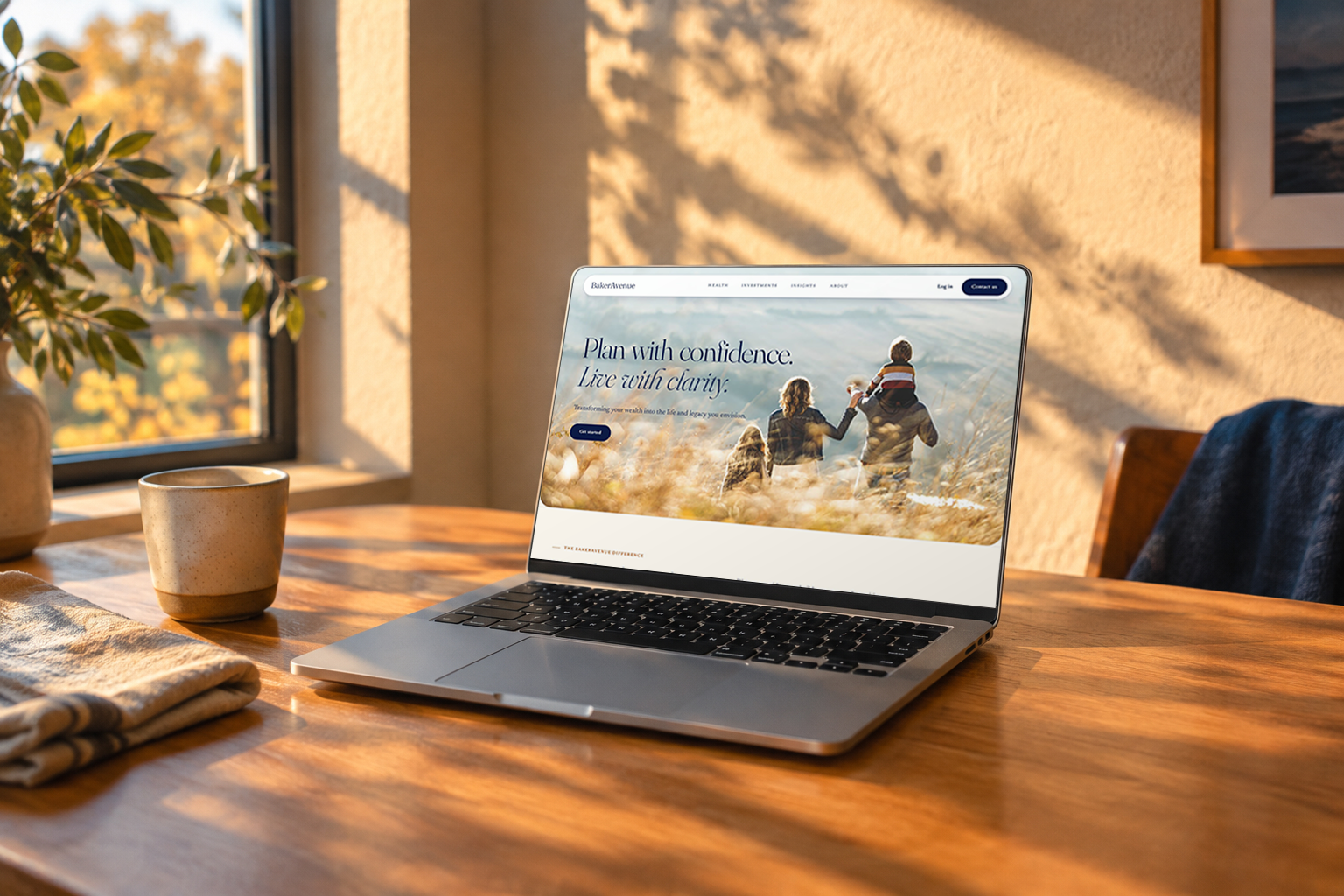

Overview
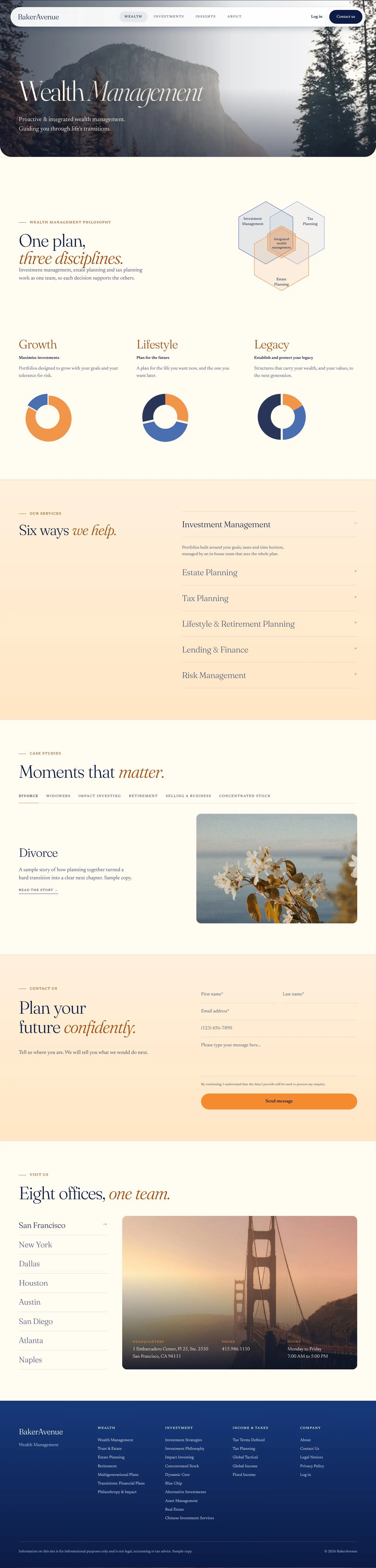
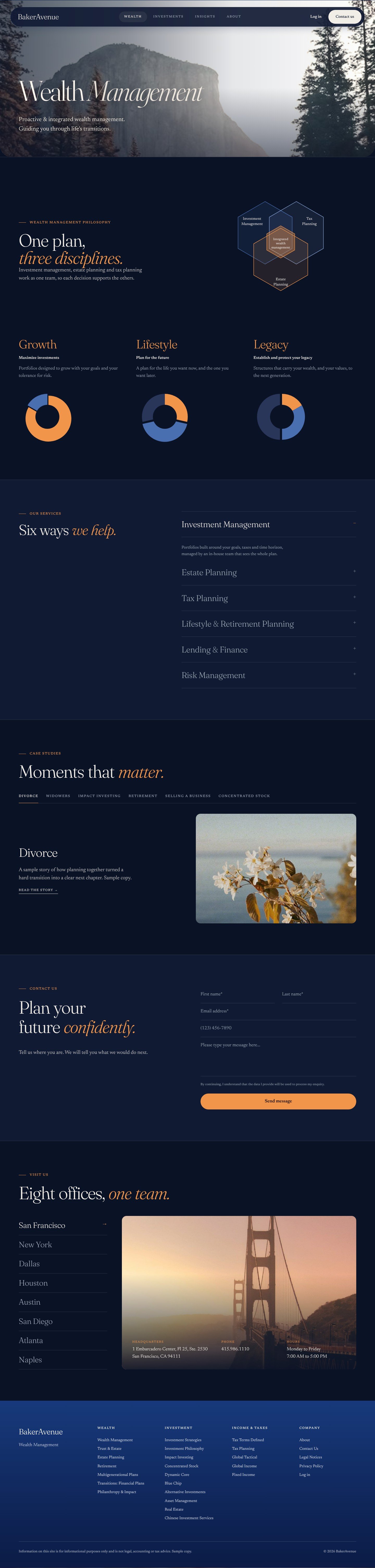
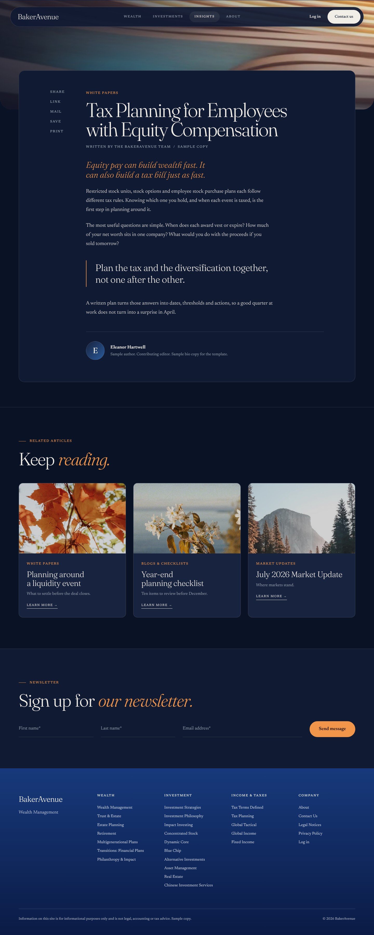
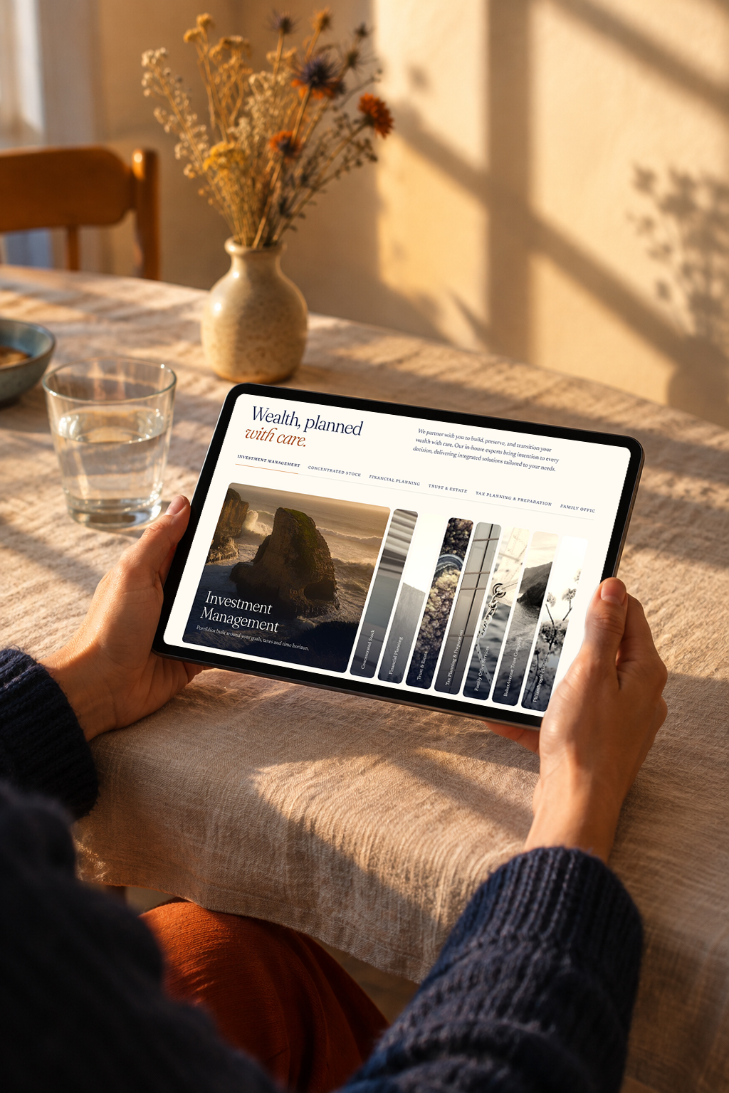
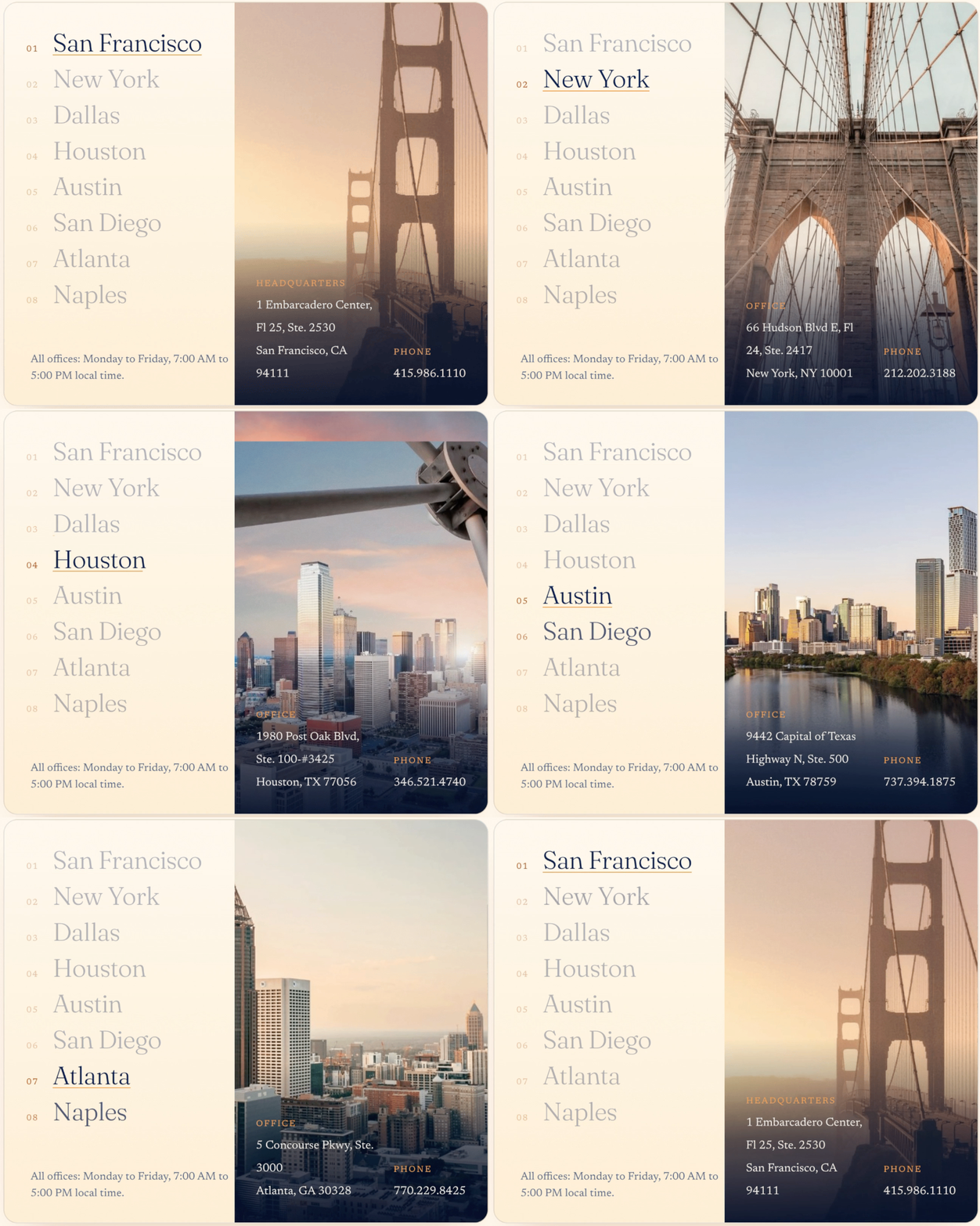
BakerAvenue guides families, executives and business owners through personal and professional transitions. Founded in 2004, the firm works from eight offices: San Francisco, New York, Dallas, Houston, Austin, San Diego, Atlanta and Naples.
I created the UX personas, the UI web design, the brand kit and the interaction design, and built the components in Figma.
I worked directly with the core team:
Simon Baker - Founder, Executive Chairman & Partner
Tom Ngo - Chief Executive Officer & Partner
Brynne Terry - Senior Growth & Experiences Manager
Terry Sheehy - Senior Director of Web Development
Key Dates:
September 2025 - Project kickoff
December 2025 - Dev-ready Figma files delivered
August 2026 - Website launch
Note: BakerAvenue’s web developer implemented the site. It keeps the structure of my design but does not match it one to one. This case study covers only the design I created.
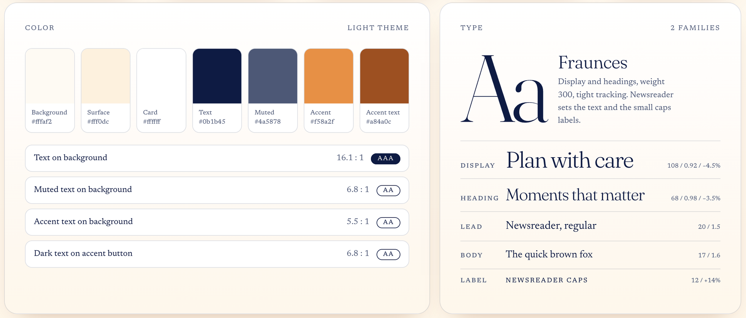
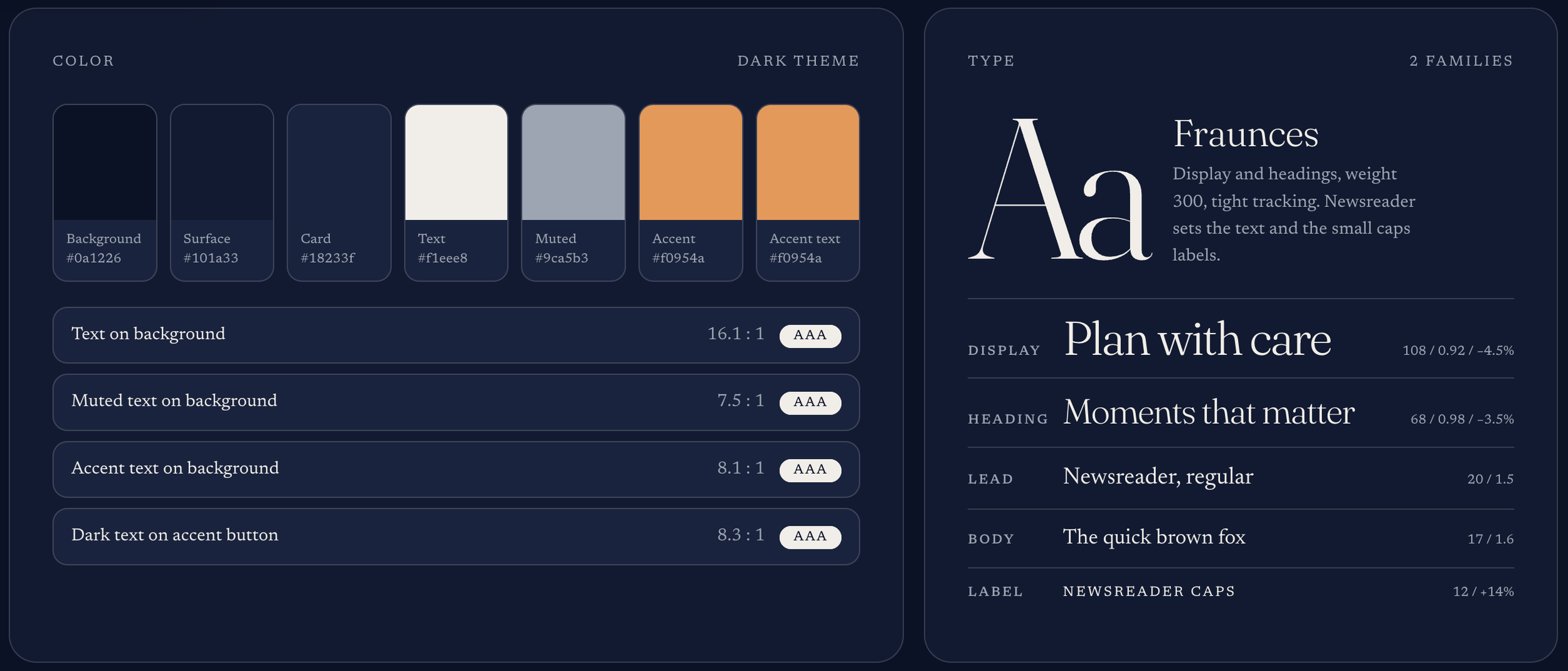
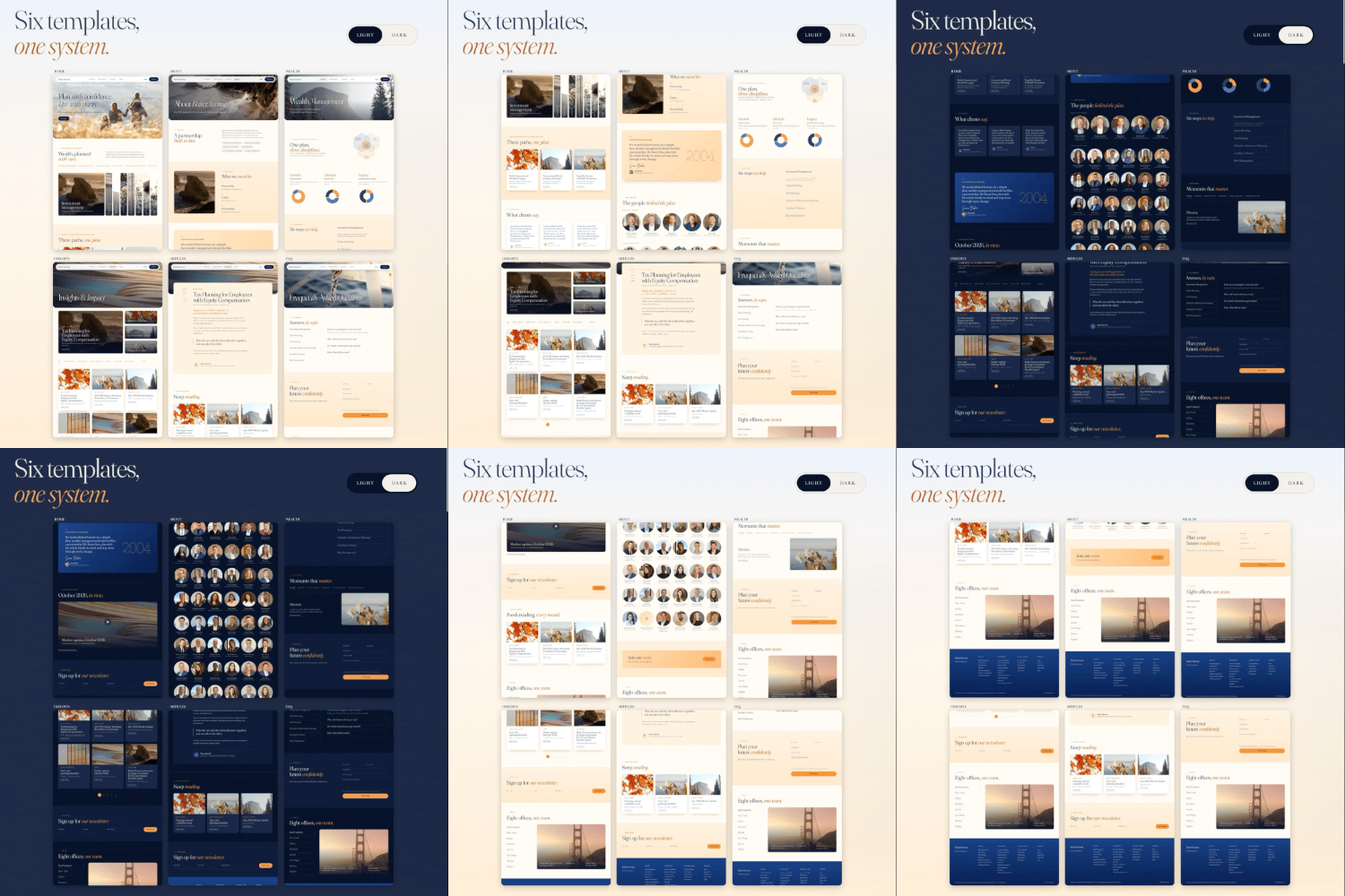
Design System & Interactions

UX Research & Strategy
OUR NORTH STARTRUST IS THE PRODUCT
BEFORE & AFTER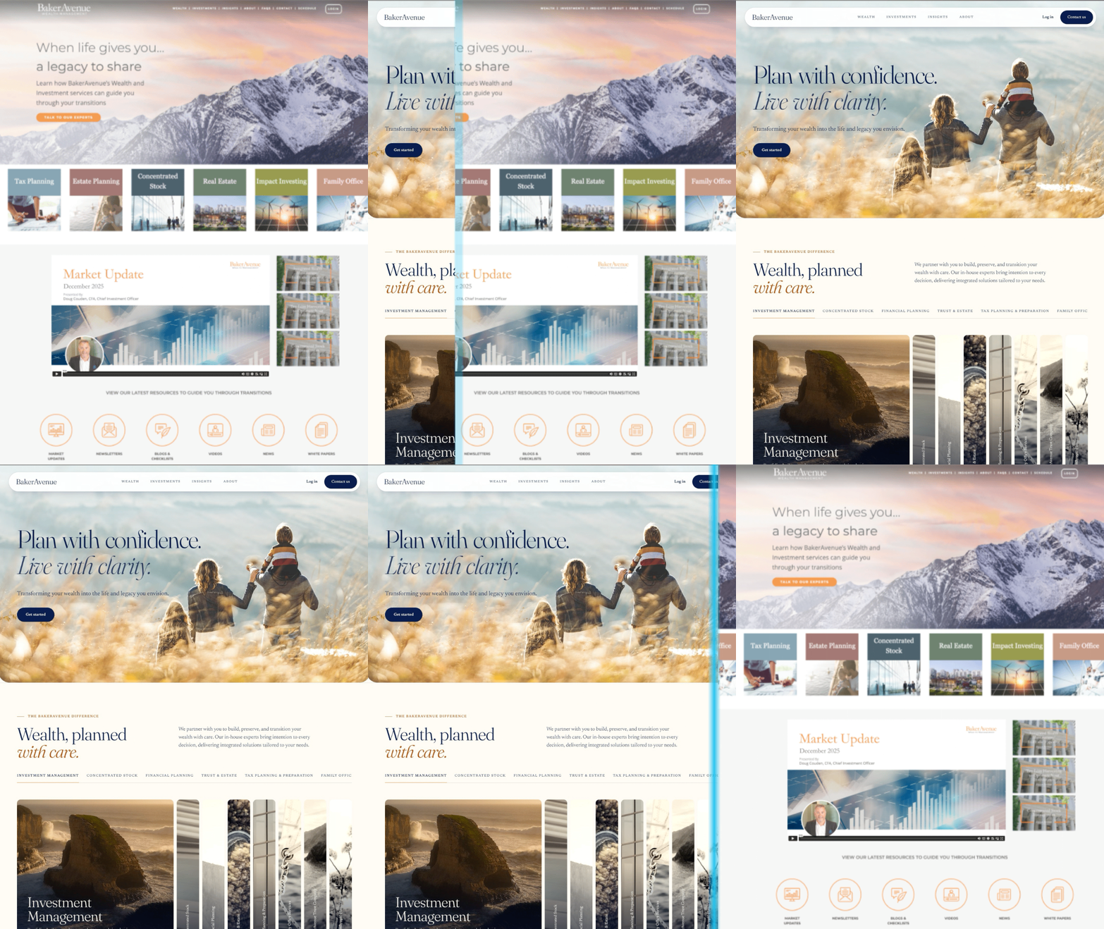
Not mobile or tablet friendly. Layouts were designed for a desktop and did not adapt to smaller screens
Broken links and broken images across pages
A complex user journey, with unnecessary pages and multiple navigation menus
A dated feel
A browser “potential scam” warning, possibly from an old SSL certificate, suspicious JavaScript or incorrect crawler information
OLD SITE PROBLEMSCHALLENGES BY AUDIENCES
Founders & CEOs
A first impression that matched the quality of the advisors and the firm’s 20-year record
B Corp values and white-glove service shown, not claimed
A brand that looks the same on a founder’s laptop, a client’s phone and a recruit’s tablet
Marketing
A steady stream of market updates, newsletters and white papers with no home that could hold them
Eight offices that needed to feel like one team
Fast, obvious ways for a visitor to get in touch or sign up
Visitors
Three very different buyers on one site: a cautious 60-year-old, a fast-moving tech executive and a values-led younger investor
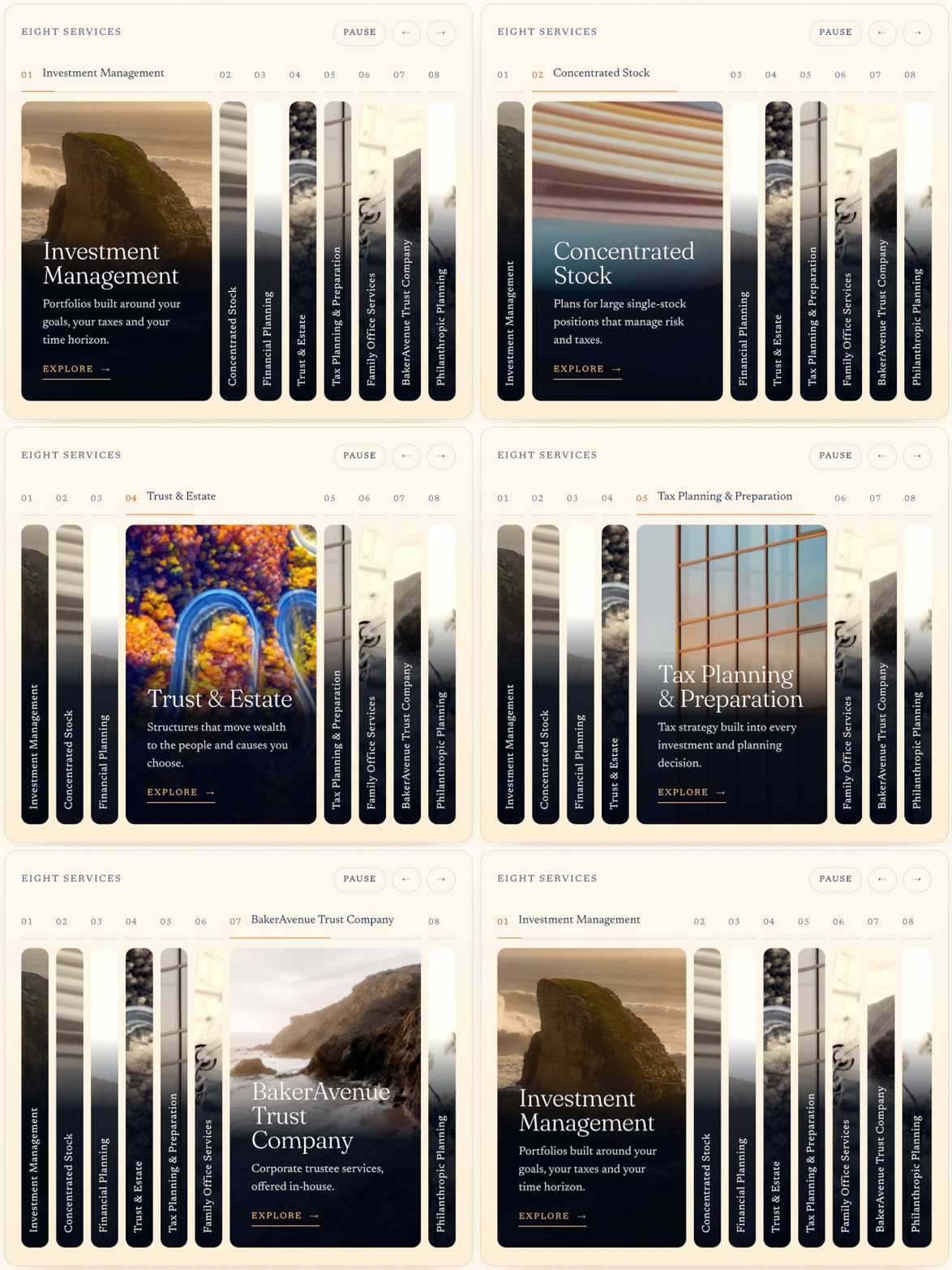
A long service list that competed for the same home page
Proof without hype: personas who distrust marketing language
BUILD CONSTRAINTS
The developer wanted to stay on ExpressionEngine, the CMS the firm already used, instead of moving to a newer stack. So the designs had to be specified as reusable components and simple tokens that could be built there.
OPPORTUNITIES
Lead with people
Sixty-five named people across eight offices is proof no stock photography can match.
Let visitors choose
“Explore the path that fits your stage in life” turns a long service list into a guided choice.
Purposeful motion
Movement answers the “dated or static” risk without adding marketing noise.
Own the warmth
Most competitors default to cold navy and gray. Warm cream, orange and family imagery fit the B Corp story.
GOALS
Earn trust quickly
Proof (team, tenure, testimonials, certifications) sits close to every decision point.
Guide, don’t push
Clear paths by life stage and persona, with less marketing language.
Work on every device
One system that stays elegant from a 1440 px desktop to a phone.
THREE PERSONAS
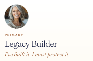
55 to 70; business owner or retired executive; $10M to $50M net worth
Decides slowly, with a CFO, spouse or attorney
Converts on credibility, the firm’s longevity, testimonials
Drops off if too much marketing; not enough customer proof
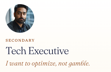
38 to 50; VP or Director at a tech company; $2M to $15M net worth
Decides fast and self-directed; wants a quick, clear contact
Converts on innovation, stability, clear dashboards and visuals
Drops off if the site looks dated or static, or lacks customer proof

28 to 40; senior employee, entrepreneur or second-generation heir; $1M to $10M net worth
Decides fast; needs a warm entry point and a quick reply
Converts on credibility and experience; the firm’s longevity
Drops off if too much marketing; not enough customer proof
DISCOVERIES
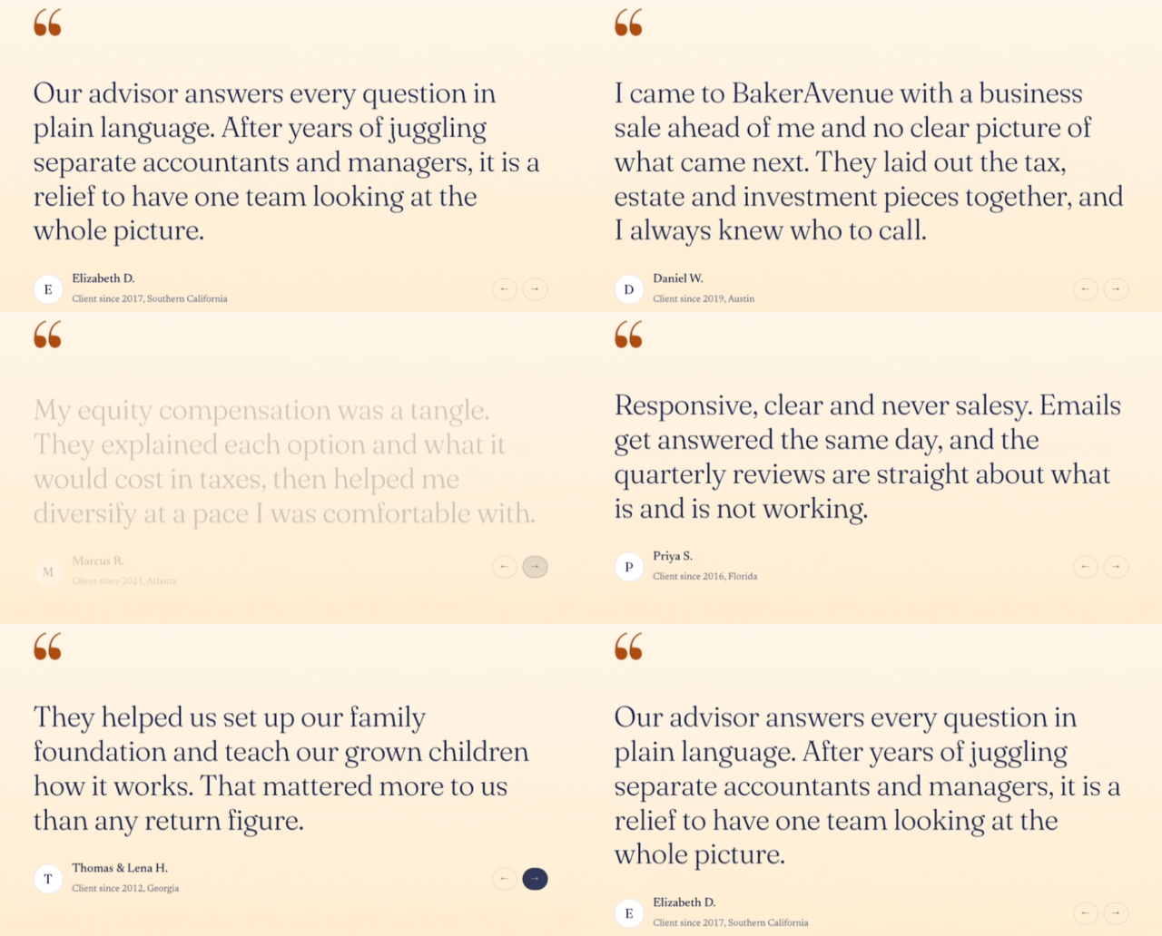
Customer proof is the common thread.
A founder note, tenure and certification badges beside the first call to action; testimonials; a full team directory with photos and titles.
It is a drop-off risk for all three personas, so it organizes every template instead of living on one page.
Tone matters as much as layout.
“Too much marketing” shaped copy and photography more than any grid decision.
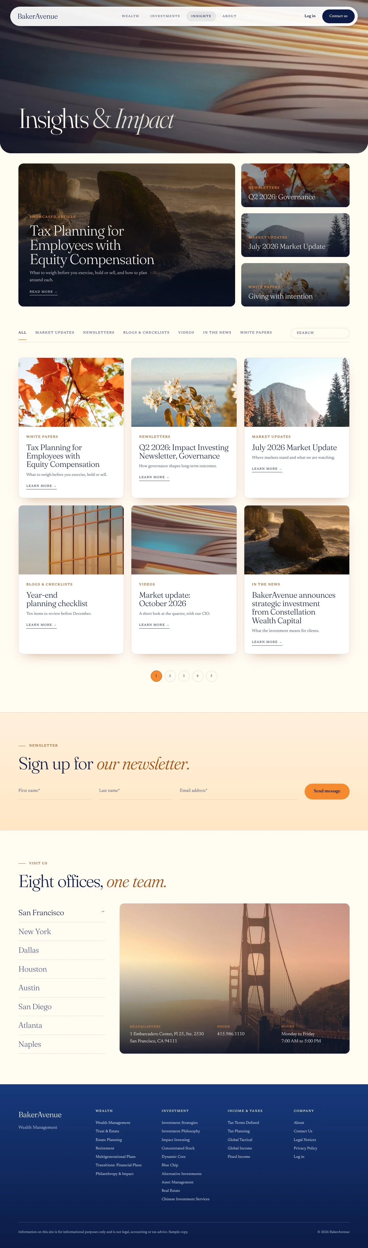
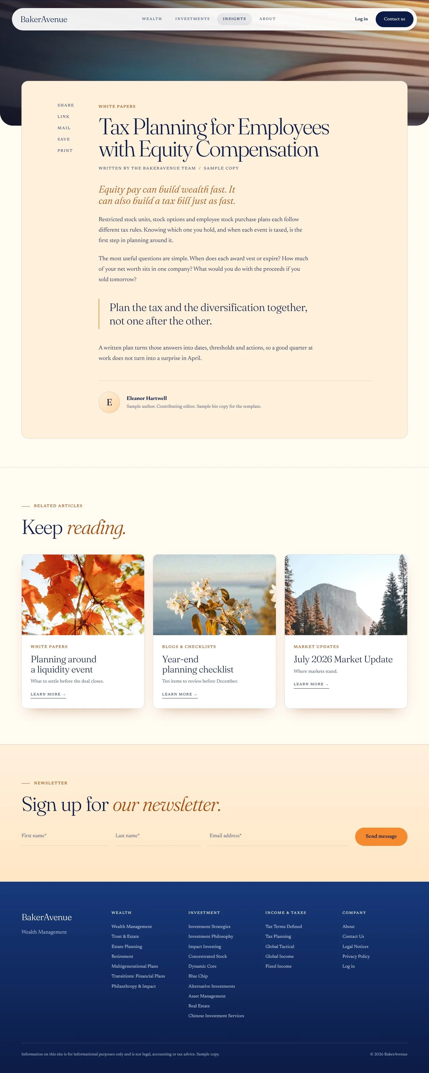
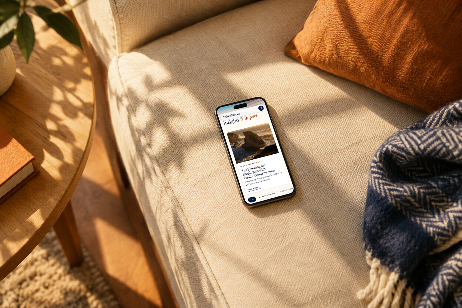
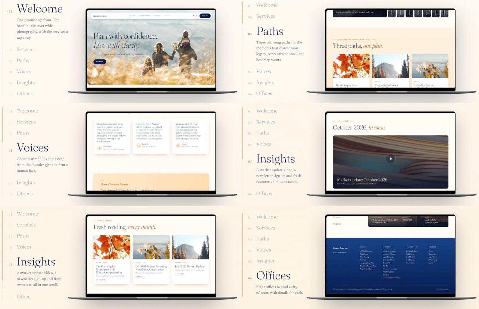
Plain headlines, short copy, calm photography of families gathering, and no text over busy imagery; the Insights & Impact page speaks in plain language
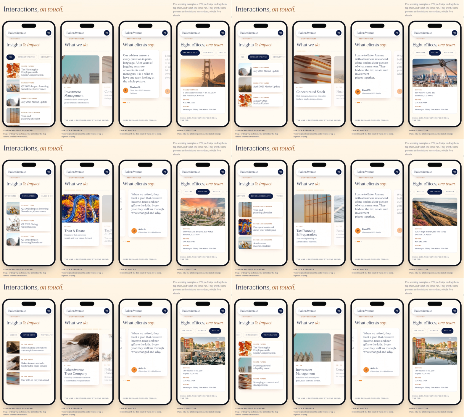
A modern system with purposeful motion: a timed service explorer, a sliding hover nav and clear card states
Fast and slow deciders want the same page in a different order.
One system with clear paths served both.
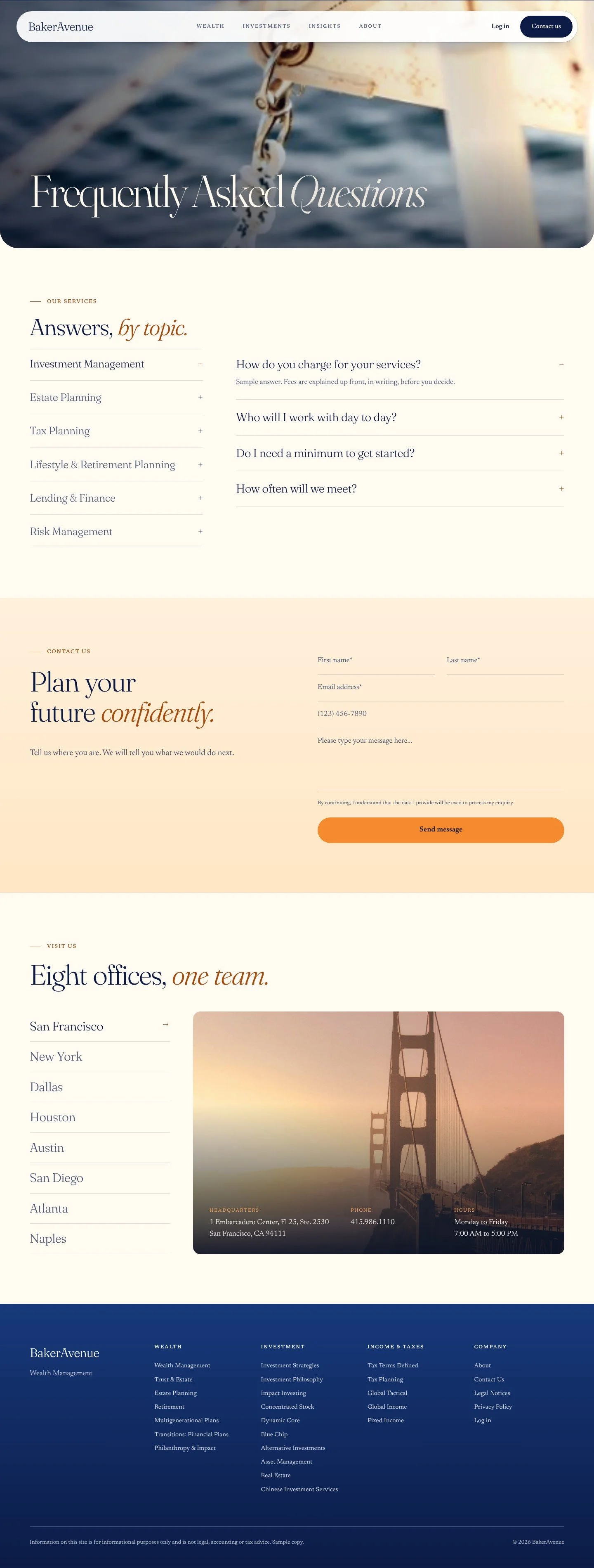
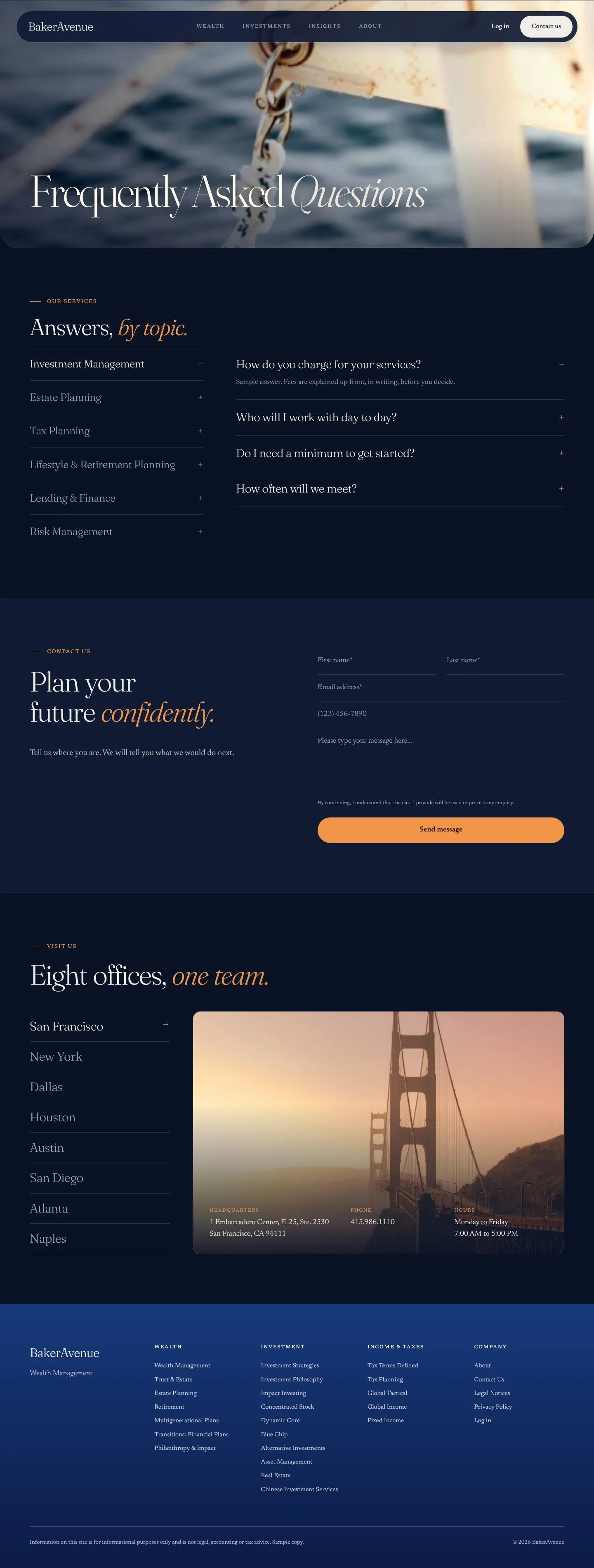
An Insights hub with its own search and filters, and an FAQ page that answers questions without a call.
One floating nav, six clear templates, planning paths by life stage led by “Multi-Generational Wealth & Legacy,” and a city selector for the nearest office.
“Contact us” in every nav; a short contact form on the Wealth and FAQ pages; warm, human headlines in place of a hard sell.
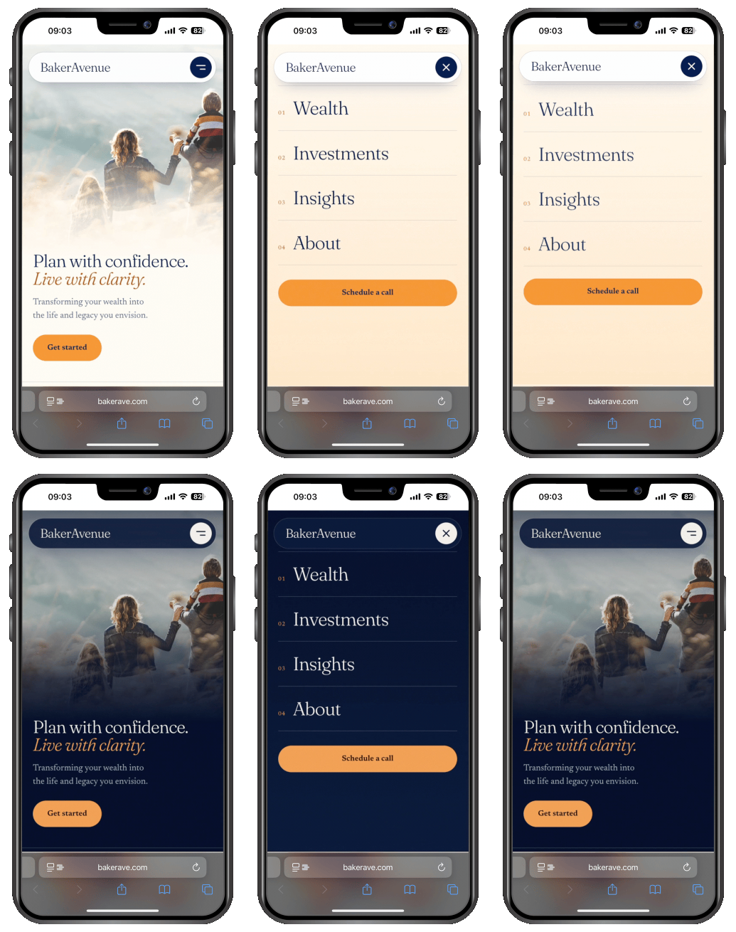
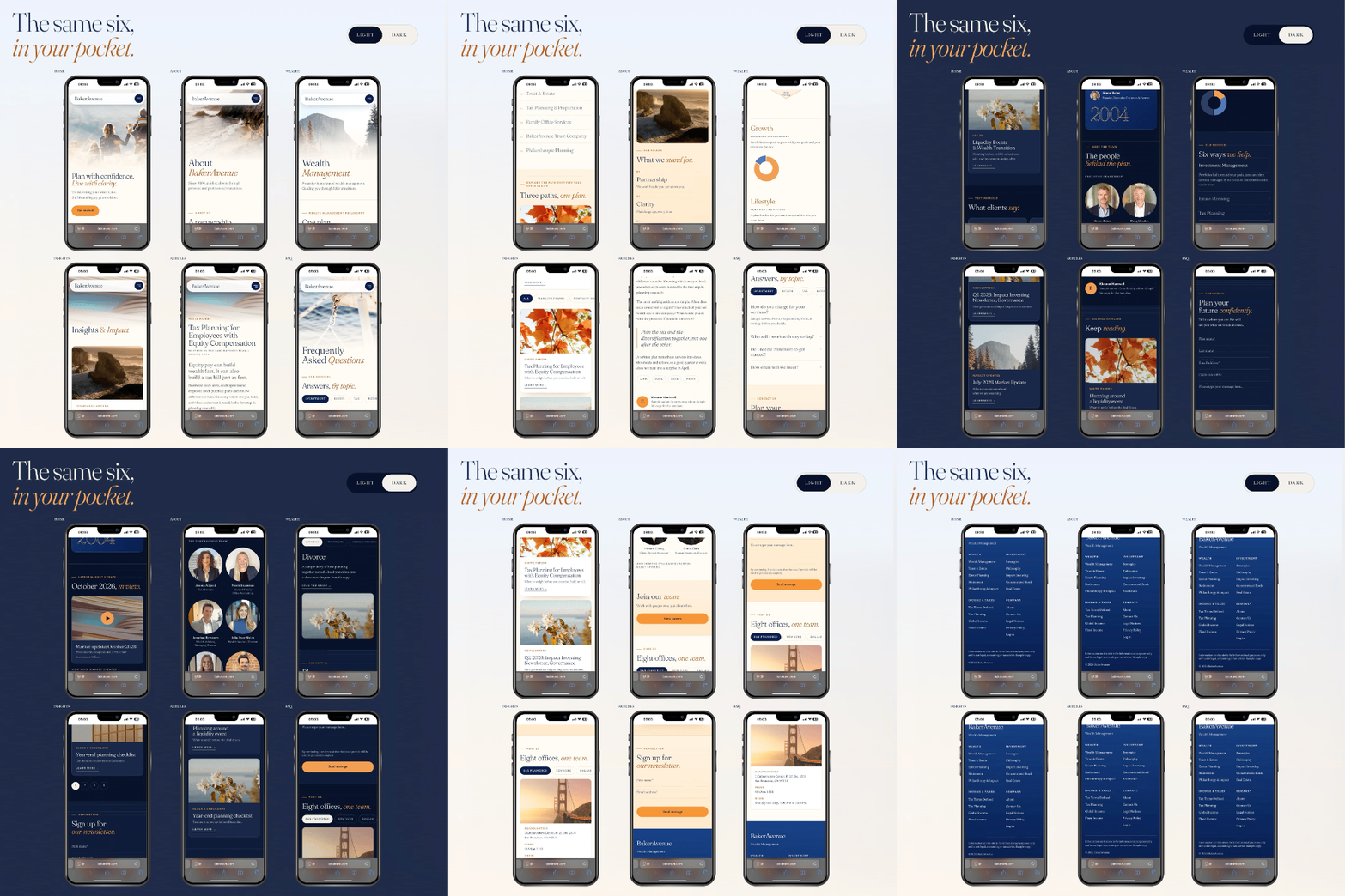
Mobile is a first-class page.
A dedicated 390 px version of every template, with a pill nav, a full-screen menu and touch-first interactions.
Touch changed the interactions themselves, not only the layout.
DIRECTION
Design
Modern, visually confident and balanced. People-first imagery. Organic, fluid motion that adds warmth and polish.
Messaging
Clear, human and purpose-driven. Concise language, simplified navigation and a value-led story.
Experience
Elegant, intuitive and responsive on every device, with clear paths to conversion.